Context
Most of the work I’ve produced is not readily shareable due to data sensitivity and data sharing agreements. To give you a sense of what a project might look like, I put together this Quarto document using the R programming language to conduct a rudimentary analysis on a publicly available dataset called the “Heart Disease Statlog”. The data comes from the UC Irvine Machine Learning Repository and contains information on 270 patients, some of whom have heart disease.
As you read through the project below, imagine you’re an administrator at a busy, understaffed hospital. There were several heart attacks recently which may have been prevented if heart disease was detected sooner. It’s not possible to have your staff check every patient for signs of heart disease, but perhaps there is a way to autonomously screen for likely heart disease using data science. I’ve included code here to show work, but skip right on over those sections if it doesn’t interest you.
Exploring the data
After we review the electronic health records for our existing patients and consult the cardiology department, we compile a set of 12 potential predictors of heart disease and one target variable indicating whether they have a diagnosis of heart disease (true / false). Below is a data dictionary describing those variables.
I write a query to extract the data for all patients served on the hospital unit in the past year. Now we need to explore the data to answer questions like:
- Are we missing any values?
- Are the values encoded properly?
- What is the distribution of values for each predictor and our target variable “Heart disease”?
| Name | statlog |
| Number of rows | 270 |
| Number of columns | 14 |
| _______________________ | |
| Column type frequency: | |
| numeric | 14 |
| ________________________ | |
| Group variables | None |
Variable type: numeric
| skim_variable | n_missing | complete_rate | mean | sd | p0 | p25 | p50 | p75 | p100 | hist |
|---|---|---|---|---|---|---|---|---|---|---|
| age | 0 | 1 | 54.43 | 9.11 | 29 | 48 | 55.0 | 61.0 | 77.0 | ▁▆▇▇▂ |
| sex | 0 | 1 | 0.68 | 0.47 | 0 | 0 | 1.0 | 1.0 | 1.0 | ▃▁▁▁▇ |
| chest-pain | 0 | 1 | 3.17 | 0.95 | 1 | 3 | 3.0 | 4.0 | 4.0 | ▁▂▁▅▇ |
| rest-bp | 0 | 1 | 131.34 | 17.86 | 94 | 120 | 130.0 | 140.0 | 200.0 | ▃▇▅▁▁ |
| serum-chol | 0 | 1 | 249.66 | 51.69 | 126 | 213 | 245.0 | 280.0 | 564.0 | ▃▇▂▁▁ |
| fasting-blood-sugar | 0 | 1 | 0.15 | 0.36 | 0 | 0 | 0.0 | 0.0 | 1.0 | ▇▁▁▁▂ |
| electrocardiographic | 0 | 1 | 1.02 | 1.00 | 0 | 0 | 2.0 | 2.0 | 2.0 | ▇▁▁▁▇ |
| max-heart-rate | 0 | 1 | 149.68 | 23.17 | 71 | 133 | 153.5 | 166.0 | 202.0 | ▁▂▅▇▂ |
| angina | 0 | 1 | 0.33 | 0.47 | 0 | 0 | 0.0 | 1.0 | 1.0 | ▇▁▁▁▃ |
| oldpeak | 0 | 1 | 1.05 | 1.15 | 0 | 0 | 0.8 | 1.6 | 6.2 | ▇▃▁▁▁ |
| slope | 0 | 1 | 1.59 | 0.61 | 1 | 1 | 2.0 | 2.0 | 3.0 | ▇▁▇▁▁ |
| major-vessels | 0 | 1 | 0.67 | 0.94 | 0 | 0 | 0.0 | 1.0 | 3.0 | ▇▃▁▂▁ |
| thal | 0 | 1 | 4.70 | 1.94 | 3 | 3 | 3.0 | 7.0 | 7.0 | ▇▁▁▁▆ |
| heart-disease | 0 | 1 | 1.44 | 0.50 | 1 | 1 | 1.0 | 2.0 | 2.0 | ▇▁▁▁▆ |
Lucky us, the data are complete–no missing information! However, some variables are not normally distributed, such as chest-pain and max-heart-rate. We may want to transform those variables later on to improve detection of their potential influence on heart disease. Also, our target variable is being treated like a number where 1 represents no disease and 2 represents disease present, but really we want it to be treated like a category. We’ll need to clean up the data set a bit before moving on.
With the data clean, let’s check to see how balanced the outcome variable is. If we have many fewer patients in one condition or the other, we may need to employ techniques like upsampling to create a sufficient sample for that condition.
Code
statlog |>
  ggplot(aes(x = `heart-disease`, fill = `heart-disease`)) +
  geom_bar() +
  geom_text(aes(label = after_stat(count)),
    stat = "count",
    vjust = -0.5) +
  labs(title = "Count of patients with and without heart disease",
       subtitle = "There is an approximately equal division of patients between conditions",
       x = "Heart disease",
       y = "Patients") +
  fill_colors +
  theme_dss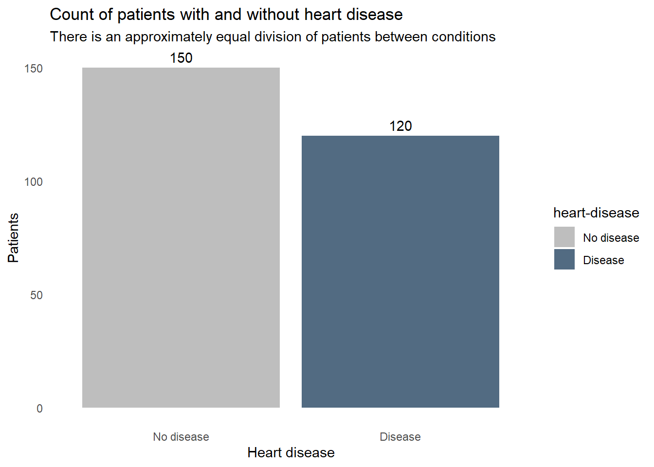
How does each of the variables relates to heart disease? These boxplots reveal some clues. For example, the patients with heart disease tend to be older, have a lower maximum heart rate, and slightly higher blood cholesterol levels. Some factors don’t seem to correlate though, resting blood pressure appears to be very similar in both patients with and without heart disease. We don’t want to include extraneous information in our screening system, so we’ll need to find which factors are important for detecting heart disease and remove any that aren’t.
Code
statlog |>
  select(statlog_list$variables |> filter(type == "Continuous") |> pull(name), `heart-disease`) |>
  pivot_longer(-`heart-disease`, names_to = "predictor") |>
  ggplot(aes(x = value, y = `heart-disease`, fill = `heart-disease`)) +
    geom_boxplot() +
    facet_wrap(vars(predictor), scales = "free_x") +
    labs(title = "Continuous predictors of heart disease",
         x = "Patients",
         y = "Heart disease") +
    fill_colors +
    theme_dss +
    theme(legend.position = "none")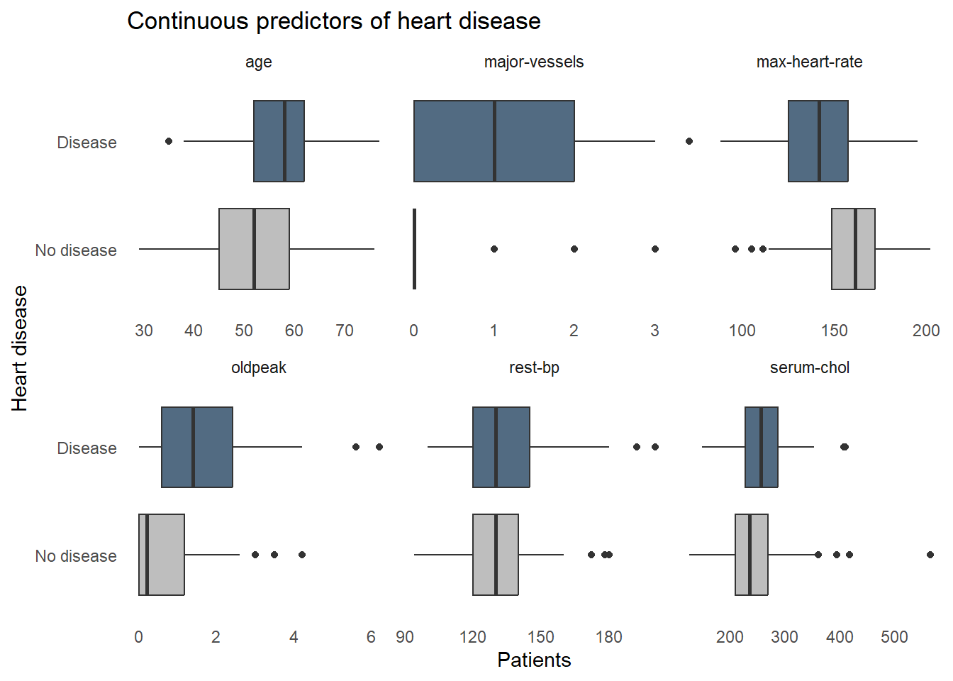
Next let’s see how heart disease is distributed among the categorical variables. Again, some factors show a strong relationship with heart disease, such as high chest pain ratings and being male, but some factors aren’t adding a lot of information, like fasting blood sugar where disease is equally prevalent for those with high and normal blood sugar.
Code
statlog |>
  select(statlog_list$variables |> filter(type %in% c("Binary", "Categorical")) |> pull(name), `heart-disease`) |>
  pivot_longer(-`heart-disease`, names_to = "predictor") |>
  ggplot(aes(x = value, fill = `heart-disease`)) +
    geom_bar(position = "fill") +
    facet_wrap(vars(predictor), scales = "free_x") +
    labs(title = "Categorical predictors of heart disease",
         y = "Proportion of subgroup patients",
         x = "Subgroup",
         fill = "Heart disease") +
    fill_colors +
theme_dss 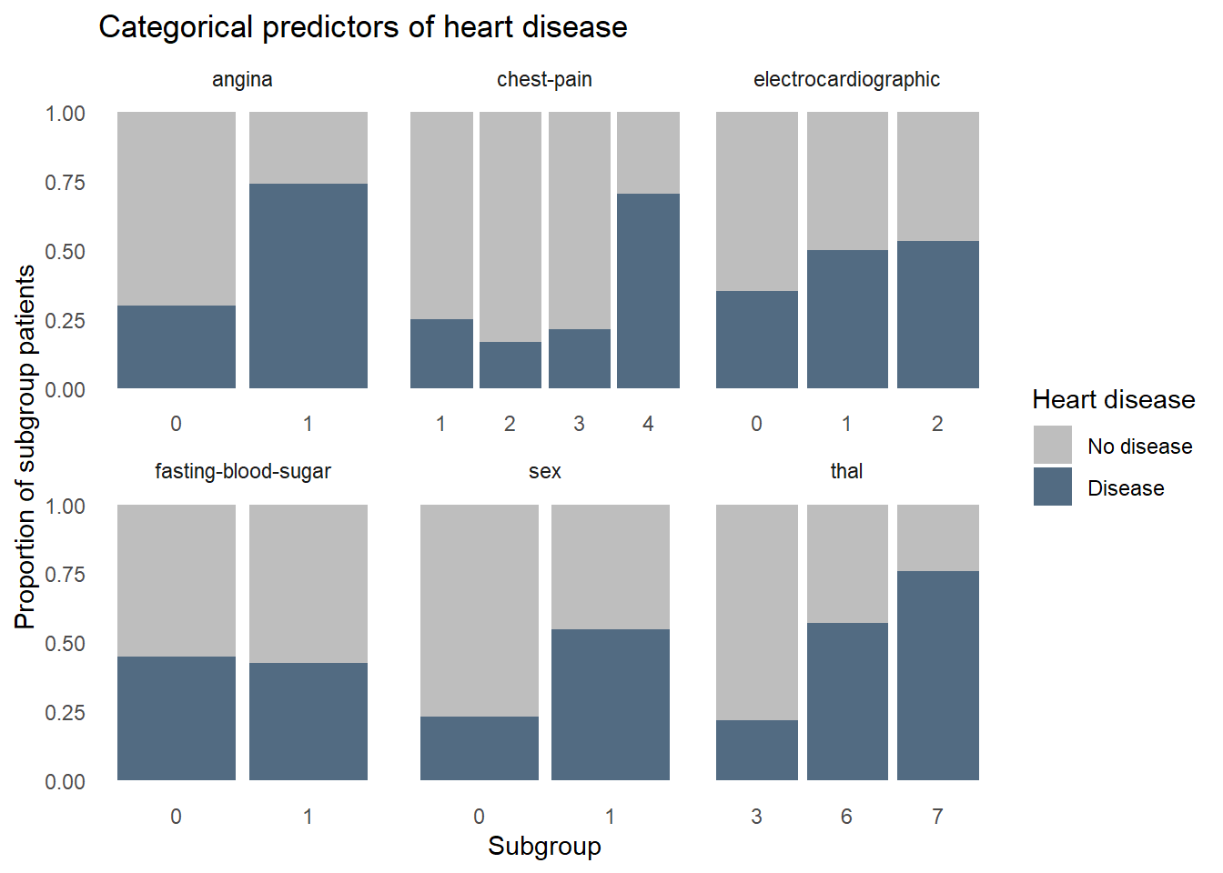
Modeling
Now that we’re familiar with the data, we can start building a predictive model. We’ll test two different types of models, a random forest and a logistic regression, and compare their performances. We’ll use stratified random sampling and k-fold cross-validation to create subsamples, known as “folds”, which retain a frequency of heart disease similar to that found in the whole dataset. We reserve 20% of the data as the ‘test’ set which will serve as the final validation of the model, as it contains data never seen during model training. The other 80% will be further split into k folds to build different models on k-1 folds and evaluate performance on the kth fold. This helps us figure out if the final model would likely generalize well with new data. The final step in the cross validation procedure is to build one last model using all k folds and evaluate it against the hold out data in the test set. We use the same test and training data to build both the random forest and logistic regression models–any differences in performance is not be due to sampling.
%% label: "Model validation procedure"
flowchart LR
  A{{Entire sample}} --> B(Test set 20%)
  A --> C(Training set 80%)
  C --> D(K fold cross validation with tuning)
  D --> E(Model consistency tested and optimal hyperparameter values identified)
  E --> F(Model rebuilt on entire training set)
  F --> G(Final evaluation)
  B --> G
To compare the models, we’ll need a common metric to assess performance. Because there is a similar number of patients with and without heart disease, we’ll use accuracy, “area under the curve receiver-operating characteristic curve” (ROC AUC), and precision to quantify both models’ performance. Accuracy represents the proportion of correctly classified observations. While intuitive, accuracy is not always sufficient. When the cost of misclassification is high, which it is in our case given that misclassifying a heart-diseased patient as healthy could kill the patient, we need alternative metrics to assess model performance. ROC AUC represents the trade off in sensitivity and specificity at every hypothetical probability threshold. In this analysis where we have a roughly balanced dataset, an ROC AUC of 1 represents a perfect model but we are very unlikely to see a value of 1 in the real world. Precision is the proportion of all patients predicted by the model to have heart disease that actually have heart disease. This metric is important because we’ll want a model that overestimates the likelihood of heart disease to ensure we don’t miss many patients.
Random Forest
We’ll begin with an approach called “Random forest” where we take a random subset of the available predictors and the observations many times, creating decision trees which seek to create very similar groups of patients. At each step in each decision tree, we’re splitting the data into two groups using a cutpoint on a single predictor that reduces heart disease heterogeneity among the resulting groups more than any other cutpoint on any other predictor. We repeat this splitting process until a stopping point is reached. The final result is produced by polling each decision tree in the random forest and taking the majority vote: heart disease or no disease. Random forests are powerful and very forgiving of perturbations and anomalies in the data, such as missing values and non-linear relationships between predictors and heart disease. This makes it a great first model to try.
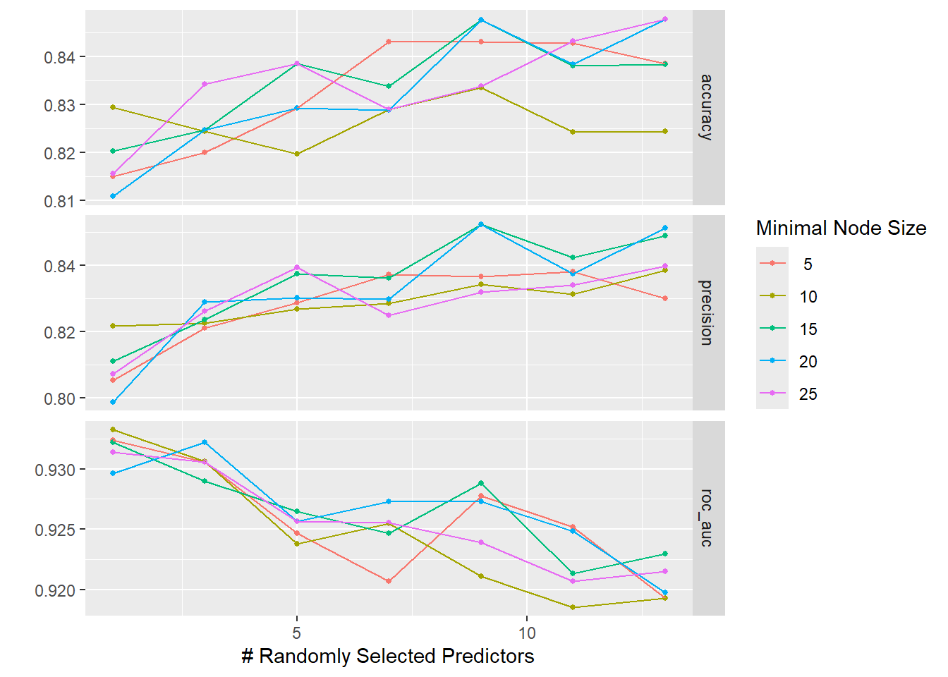
We preprocess the data in a “recipe” before modeling to prevent confounding results. We combine the model specification and the recipe in a “workflow”, which makes it easier to repeat some tasks later when creating a logistic regression model. We use a “regular grid” to tune the models with a predefined set of hyperparameter value combinations and store the results of each configuration’s performance for each fold in the training set.
The graphs below show that neither of the tuning parameters had much of an impact on the final model performance, giving us some choice in how to configure the final model’s hyperparameters.
Code
The accuracy and ROC AUC values seen when using the final model on the test data are not as good as those seen during cross-validation. This suggests that the model is slightly overfit to the data, meaning we picked up on some subtle patterns in the training data that did not generalize to the test data.
Code
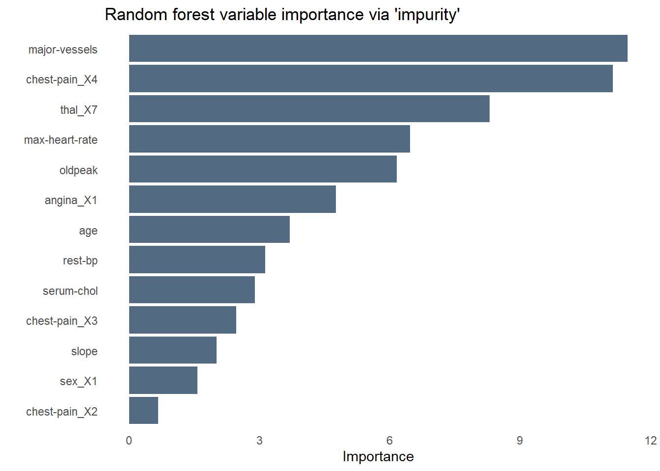
The bar chart below shows the relative importance of each variable used by the random forest using a measure of variable importance called “impurity”. Unsurprisingly, chest pain is the most important predictor of heart disease–specifically those who rated their chest pain at the highest level of “4”. As we saw while exploring the data earlier, fasting blood sugar is no help at all in predicting heart disease. Angina is less influential than I would have expected, perhaps sharing some of the variance it explains with another predictor like chest pain.
Code
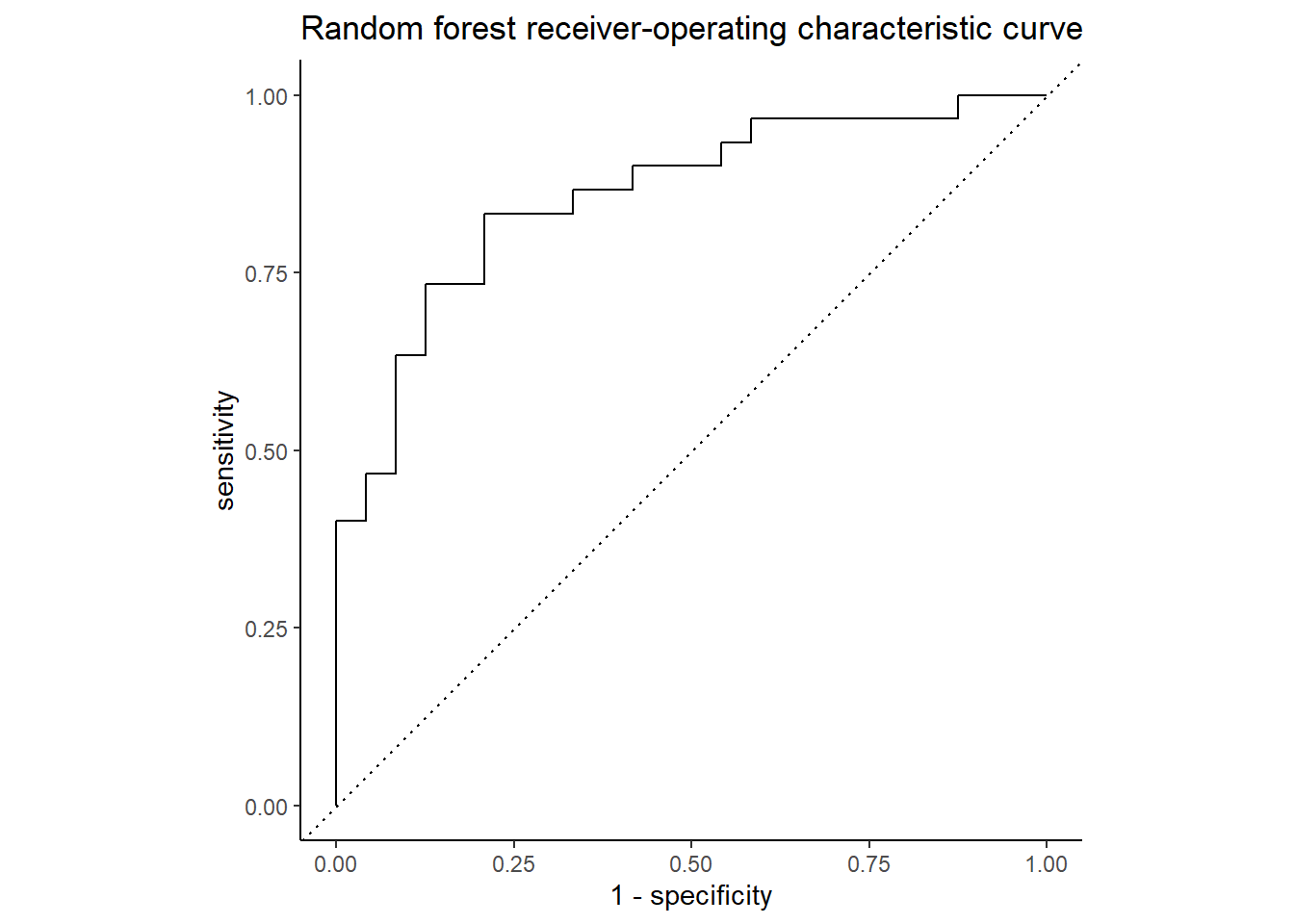
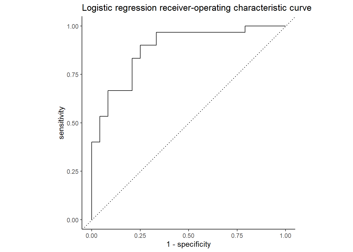
The ROC curve below shows the true positive rate (predicted heart disease, was heart disease) on the y-axis, labeled “sensitivity”, and the false positive rate (predicted heart disease, was healthy) on the x-axis, labeled “1 - specificity”. Nearly 86% of the chart area lies under the curve, showing the model has a respectable capacity to discern heart disease from the predictors and doesn’t merely guess, though the confusion matrix below it suggests the model is better at predicting an absence of heart disease than its presence.
Code
Code
conf_mat_resampled(hd_last_rf_fit) |>
  ggplot(aes(Freq, Truth, fill = Prediction)) +
    geom_bar(position = "fill", stat = "identity") +
    labs(title = str_wrap(
      "Random forest did better at identifying health patients than those with heart disease",
      width = 70),
         x = "Frequency",
         y = "Truth") +
    fill_colors +
    theme_dss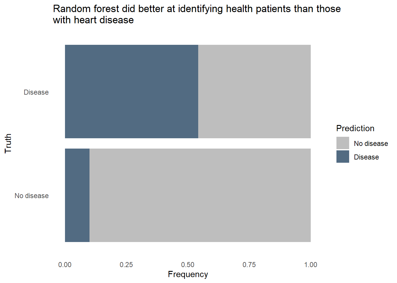
The random forest model did pretty well identifying healthy patients, classifying about 9 in 10 healthy patients correctly. However, it only classified about 7 in 10 patients with heart disease correctly. Given how dangerous it would be to use a predictive model that often misses instances of heart disease, we’ll want to reduce that false negative rate. It would also be helpful to know exactly how each predictor relates to heart disease prediction, and random forest models are fairly opaque, relying on feature importance to tell that story. We’ll need to try a different type of model to see if we can accurately classify a much larger proportion of patients with heart disease, even if it comes at the expense of false positives.
Logistic regression
Logistic regression makes more assumptions about the data and the relationships between variables than does the random forest method. Non-linear relationships must be properly handled, possibly by using a logarithmic or polynomial transformation in order for the model to perform well. Unlike random forests, logistic regression does not naturally attenuate or even drop variables of lesser importance. To help us remove the variables that not useful for predicting heart disease, such as blood sugar levels, we’ll use a variation on the classic logistic regression called “lasso” regression. In a lasso, we add a new term to the standard logisitic regression equation which represents a penalty. When the penalty is sufficiently large, some predictors’ values will be converted to zeros, effectively dropping them from the model.
Code
hd_lr_model <-
logistic_reg(penalty = tune(),
mixture = 1) |>
set_engine("glmnet") |>
set_mode("classification")
hd_lr_recipe <-
recipe(`heart-disease` ~ ., data = hd_train) |>
step_dummy(all_nominal_predictors()) |>
step_nzv(all_predictors()) |>
step_normalize(all_predictors())
hd_rf_recipe |> prep(hd_train)
hd_lr_wf <-
workflow() |>
add_model(hd_lr_model) |>
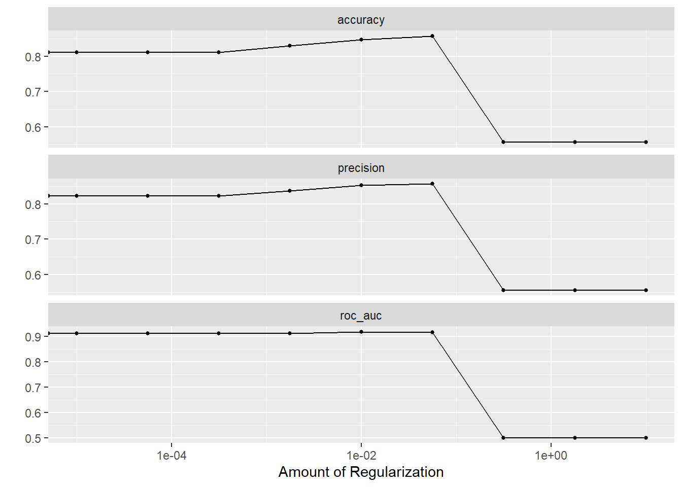
add_recipe(hd_lr_recipe)How large a penalty should we use in the lasso? Too large and we will have a model that has dropped so many predictors that we can’t sufficiently predict heart disease. Too small and we’ll retain unimportant predictors and overfit the model to the training data. Our goal is to find a penalty that creates the most parsimonious model within one standard error of the best predictive model. We’ll use a “regular grid” for tuning to identify this ideal penalty value.
The plots below show that model performance gradually improved as the penalty value increased, shrinking the influence of less important predictors and even removing some entirely, but hits a cliff around 1e-01. The penalty value in this model is extremely important.
Using the best penalty value discovered by tuning, we evaluate the model’s performance on the test data.
Code
set.seed(111)
hd_last_lr_fit <-
  hd_lr_wf |>
  finalize_workflow(hd_lr_res |>
                    select_by_one_std_err(metric = "precision", penalty)) |>
  last_fit(hd_splits,
           metrics = hd_metrics)

hd_lr_perf <- hd_last_lr_fit |>
  collect_metrics() |>
  mutate(model = "logistic lasso regression")

hd_lr_perf |> select(Metric = `.metric`, Estimate = `.estimate`)
Code
Code
conf_mat_resampled(hd_last_lr_fit) |>
  ggplot(aes(Freq, Truth, fill = Prediction)) +
    geom_bar(position = "fill", stat = "identity") +
    labs(title = str_wrap(
      "Logistic lasso regression did better at identifying health patients than those with heart disease",
      width = 70),
         x = "Frequency",
         y = "Truth") +
    fill_colors +
    theme_dss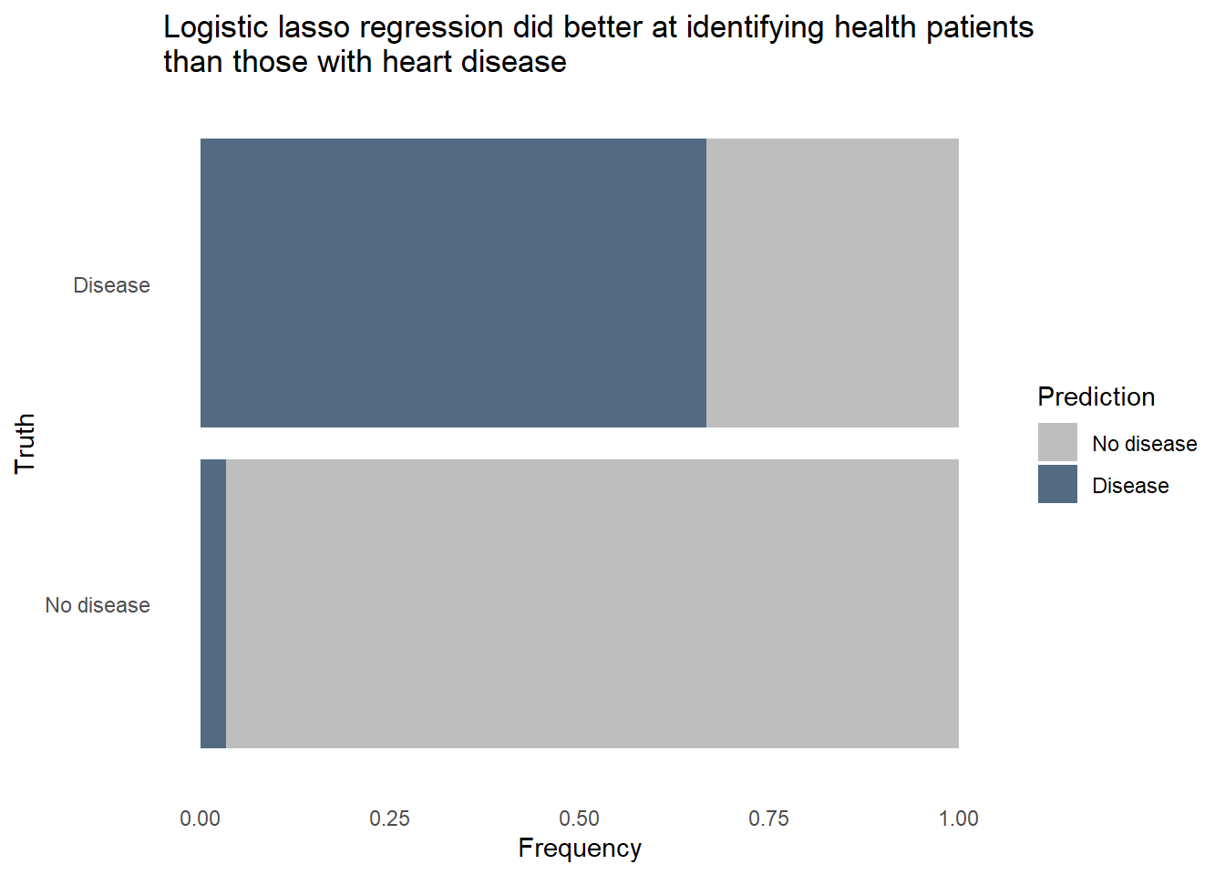
The logistic regression outperformed the random forest on all 3 metrics, uses fewer predictors in the final model, and is more easily interpreted. Furthermore, we can revise the threshold for flagging to make the model more sensitive to heart disease at the expense of more false positives. Let’s see how the model would classify the same patients from the test set if we lower the threshold for predicting heart disease.
Code
hd_last_lr_fist_biased <- hd_last_lr_fit |>
  collect_predictions() |>
  mutate(Prediction = factor(if_else(`.pred_Disease` > 0.18, "Disease", "No disease"),
                             levels = c("No disease", "Disease"))) |>
  group_by(`heart-disease`, Prediction) |>
  summarize(n = n())


hd_last_lr_fist_biased |>
  ggplot(aes(n, `heart-disease`, fill = Prediction)) +
    geom_bar(position = "fill", stat = "identity") +
    labs(title = str_wrap(
      "Logistic lasso regression with a lowered threshold correctly flagged 22 of 24 (91.6%) heart-diseased patients",
      width = 70),
         x = "Frequency",
         y = "Truth") +
    fill_colors +
    theme_dss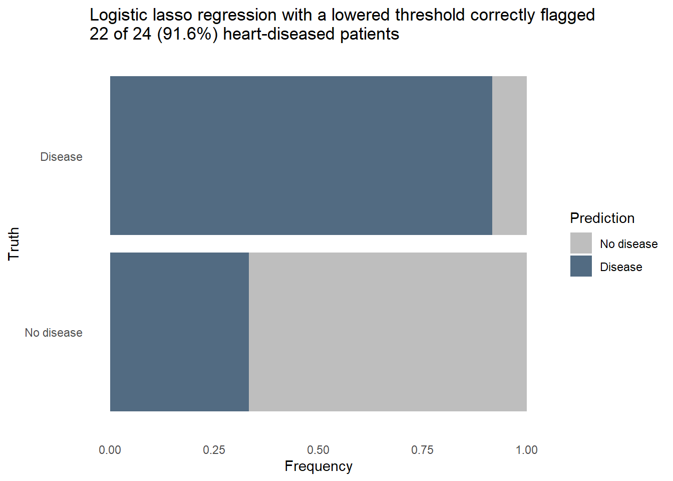
Nearly every patient with heart disease was correctly flagged. A further dive into the model tells us how it knows to flag a patient as likely having heart disease. The model coefficients shown below are filtered to remove predictors who’s contribution to the model was nullified by the penalty applied in the lasso. This subset contains the things that really matter for predicting heart disease. When the values are positive, it means the change of heart disease increases as the predictor’s value increase, or in the case of a categorical predictor when a particular category is present. We can see that high chest pain and the number of major vessels increase the likelihood of heart disease, while a high maximum heart rate is a protective factor.
Code
hd_lr_coeffs <- hd_last_lr_fit |>
  extract_fit_parsnip() |>
  tidy() |>
  filter(estimate != 0 & term != "(Intercept)") |>
  select(-penalty) |>
  arrange(abs(estimate))

hd_lr_coeffs |>
  ggplot(aes(x = estimate, y = fct_reorder(term, estimate))) +
  geom_col(aes(fill = estimate)) +
  scale_fill_gradient2(low = "#69A88D", high = "#B0151B") +
  labs(title = "Predictors in the final model and their relationship to heart disease",
       x = "Coefficient value",
       y = "Predictor") +
  theme_minimal() +
  theme(legend.position = "none")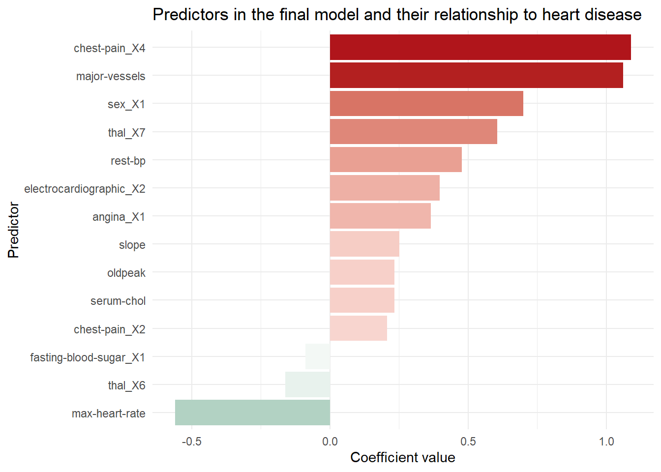
Conclusion
The final model uses logistic lasso regression to correctly identify nearly all patients with heart disease while creating false positives for about 1/3 of the healthy patients. In a real world setting, successfully identifying even 92% of patients with heart disease may not be sufficient to pass muster in a clinical setting, though if there is not enough staff or resources to check every patient it may be the next best thing. A model like this could be deployed in the electronic health record system of the hospital to flag at-risk patients who’s condition might otherwise go unnoticed or noticed belatedly. With more data and better predictors we could potentially refine the model to be even more successful.
How could data science like this be helpful in your work? Contact me and we can find out together.